Link here.
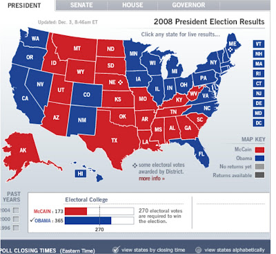
These kinds of maps display data nominal data with color. The color is not shaded in proportion with frequency of data like in a regular choropleth map, because it cannot be since this is nominal data. This one shows the results of the 2008 Presidential election.

No comments:
Post a Comment